

flex 布局初体验
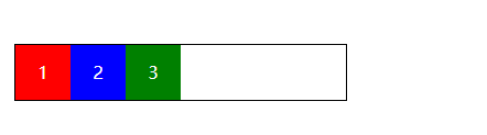
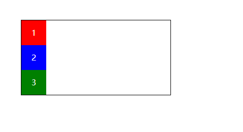
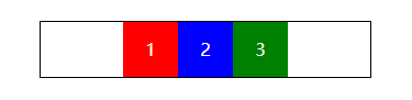
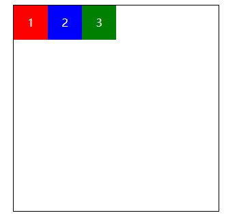
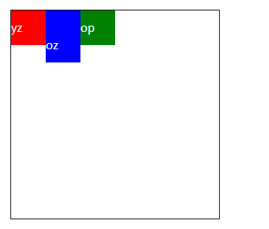
假设我们要实现一个这样的布局,三个色块水平排版;
一般写法
<!DOCTYPE html>
<html lang="en">
<head>
    <meta charset="UTF-8">
    <meta name="viewport" content="width=device-width, initial-scale=1.0">
    <title>flex</title>
    <style></style>
    <link rel="stylesheet" href="index.css">
</head>
<body>
    <ul>
        <li>1</li>
        <li>2</li>
        <li>3</li>
    </ul>
</body>
</html>
*{
margin: 0;
padding: 0;
}
ul {
margin: 50px;
border: 1px solid #000000;
overflow: hidden;
width: 300px;
color: #ffffff;
}
li {
line-height: 50px;
list-style: none;
height: 50px;
width: 50px;
background-color: blue;
text-align: center;
float: left;
}
ul li:first-child {
background-color: red;
}
ul li:last-child{
background-color: green;
}从代码看出,我们用了浮动。而且浮动布局并不会撑起父元素的高度,我们还需要清除浮动(overflow: hidden;)
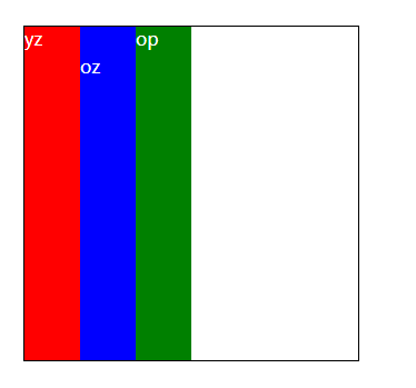
用flex布局实现
*{
    margin: 0;
    padding: 0;
}
ul {
    margin: 50px;
    border: 1px solid #000000;
    /* overflow: hidden; */
    width: 300px;
    color: #ffffff;
    display: flex;
}
li {
    line-height: 50px;
    list-style: none;
    height: 50px;
    width: 50px;
    background-color: blue;
    text-align: center;
    /* float: left; */

}

ul li:first-child {
    background-color: red;
}
ul li:last-child{
    background-color: green;
}
我们只需要告诉父元素,display: flex; 即可实现。是不是 so easy!
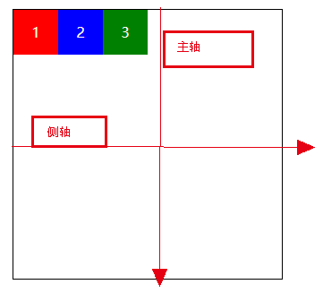
基本概念
- 伸缩容器: 在上述的示例中,ul 即为伸缩容器
- 伸缩项: 伸缩容器的子元素,就是伸缩项,在上述示例中,li 为伸缩项
- 主轴: 在默认情况下水平方向上称为主轴,主轴的从左到右 分别为 主轴的起点、主轴的终点
- 侧轴:在默认情况下垂直方向上称为侧轴,侧轴的从上到下 分别称为 侧轴的起点、侧轴的终点
图示说明:
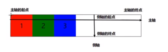
主轴方向
*{
    margin: 0;
    padding: 0;
}
ul {
    margin: 50px;
    border: 1px solid #000000;
    width: 300px;
    color: #ffffff;
    display: flex;
}
li {
    line-height: 50px;
    list-style: none;
    height: 50px;
    width: 50px;
    background-color: blue;
    text-align: center;

}

ul li:first-child {
    background-color: red;
}
ul li:last-child{
    background-color: green;
}
以上代码的效果:
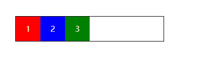
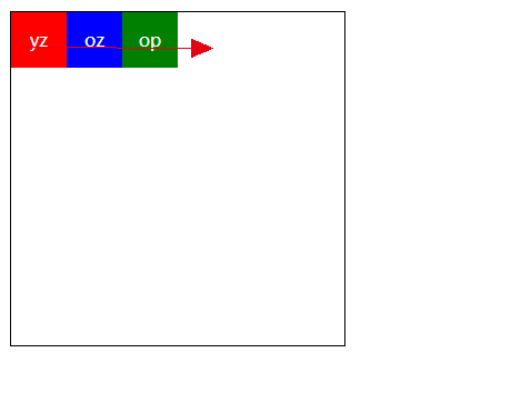
可以看到,flex 默认的排版时从左到有的,即主轴方向是水平向右的。如果需要想要从右向左,则需要修改主轴的起点方向。
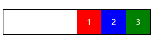
- 相关属性:flex-direction
- 属性参数: row(默认:水平从左到右)row-reverse(从右到左)
我们来试一下不同的取值:
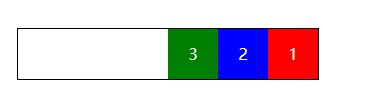
row-reverse(主轴从右到左)
ul{
    flex-direction: row-reverse;
}
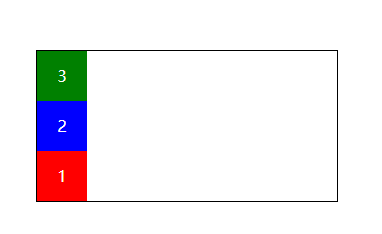
column(主轴方向垂直从上到下)
ul{
    flex-direction: column;
}
column-reverse(主轴反向垂直从下到上)
注意点:只要主轴发生了变化,侧轴也会变化,永远都是十字交叉的。
主轴的对齐方式
- 相关属性: justify-content
相关取值效果展示:
注意: 此时的 主轴方向 为默认的 row 取值
- flex-start(默认) : 让伸缩项与主轴起点对齐
ul {
 margin: 50px;
 border: 1px solid #000000;
 width: 300px;
 color: #ffffff;
 display: flex;
 flex-direction: row;
 justify-content: flex-start; // 修改不同的取值
}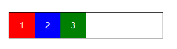
- flex-end :让伸缩项与主轴终点对齐
- center: 伸缩项位于主轴的中点
- space-between: 两端对齐
先看效果再说原理:
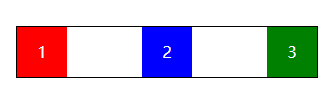
每两个伸缩项间的距离 = (伸缩容器的宽度 - 所有伸缩项的宽度的总和) / (伸缩项的个数 - 1)
伸缩项(个数大于2时)的排列规律是:起点、终点各一个,剩下的间距为 每两个伸缩项间的距离。
5.space-around 环绕对齐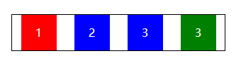
每个伸缩项的两边的距离 = (伸缩容器的宽度 - 所有伸缩项的宽度的总和) / (伸缩项的个数 * 2)
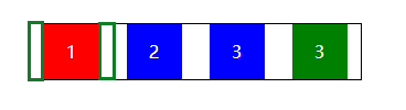
上图中,绿色小方块的距离即为:每个伸缩项的两边的距离
总结:
- flex-direction 告诉伸缩容器主轴的的方向
- justify-content 告诉伸缩项的对齐规则
侧轴对齐方式
开始之前,修改下 伸缩容器 ul 的告诉为 600px;
ul {
    margin: 50px;
    border: 1px solid #000000;
    width: 300px;
    height: 600px;  /*增加了此处*/
    color: #ffffff;
    display: flex; /*默认*/
    flex-direction: row; /*默认*/
}
相关属性:
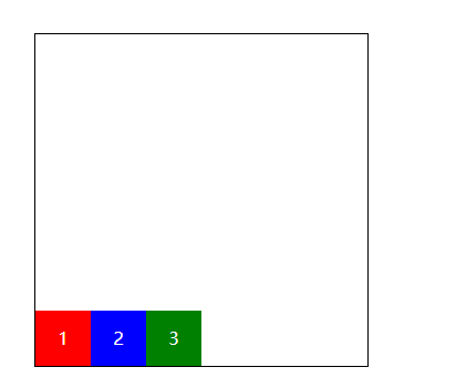
- align-items 侧轴对齐方式
ul {
  margin: 50px;
  border: 1px solid #000000;
  width: 300px;
  height: 300px;
  color: #ffffff;
  display: flex;
  flex-direction: row;
  align-items: flex-start; /*增加了此处*/
}
属性:
- flex-start(默认)和侧轴起点对齐
flex-end: 和侧轴终点对齐
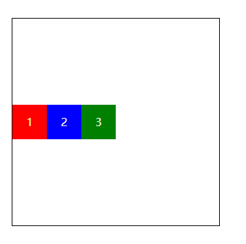
center:和侧轴中点位置对齐
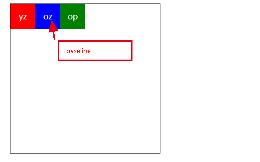
- baseline 基线对齐,让所有伸缩项的基线对齐
再来个图: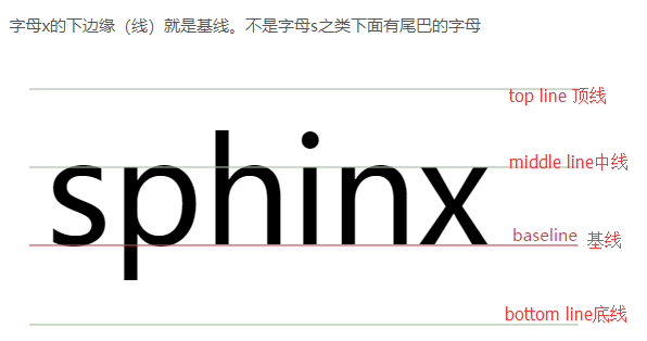
baseline的确定规则
a) . inline-table元素的baseline是它的table第一行的baseline
b). 父元素【line box】的baseline是最后一个inline box 的baselineinline-block元素的baseline确定规则
规则1:inline-block元素,如果内部有line box,则inline-block元素的baseline就是最后一个作为内容存在的元素[inline box]的baseline,而这个元素的baseline的确定就要根据它自身来定了。
规则2:inline-block元素,如果其内部没有line box或它的overflow属性不是visible,那么baseline将是这个inline-block元素的底margin边界。
为了看到更清楚:
li {
    line-height: 50px;
    list-style: none;
    height: 50px;
    width: 50px;
    text-align: center;

}

ul li:nth-child(2) {
    background-color: blue;
    padding-top: 25px; /*新增的内容*/
}
可以看出,只有将第一个和第二和顶下来,才能保证三个伸缩项保持基线对齐。
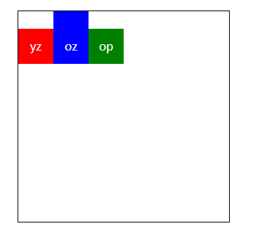
- stretch 拉伸对齐(等高对齐) 让所有伸缩项的高度变为侧轴的高度
ul {
    margin: 50px;
    border: 1px solid #000000;
    width: 300px;
    height: 300px;
    color: #ffffff;
    display: flex;
    flex-direction: row;
    align-items: stretch; /*修改了此处*/
}
注意:如果要使用拉伸对齐,那么伸缩项就不能设置高度,否则会失效
修改代码:
li {
     /* line-height: 50px; */ /*注释掉他*/
    list-style: none;
    /* height: 50px; */ /*注释掉他*/
    width: 50px;
    text-align: stre;
}
总结
- align-items 规定了侧轴的对齐方式
- 和主轴对齐属性(justify-content)相比,侧轴对齐属性没有两端对齐和环绕对齐,但是新增了其他属性
侧轴的对齐方式2(设置单独的某个伸缩项在侧轴的对齐方式)

